Interior design isn’t reserved for professionals with expensive degrees or unlimited budgets. Anyone willing to spend a weekend thinking through their space, and making intentional choices about style, color, and function, can transform a room from bland to beautiful. Home interior design is fundamentally about understanding what works for the people living in it: how light moves through a room, where traffic naturally flows, and which colors actually make someone feel at home. Whether tackling a single bedroom or redesigning an entire floor plan, the principles remain the same. This guide walks through the practical steps to develop a cohesive design that reflects personal style while solving real spatial and functional challenges.
Key Takeaways
- Interior design home transformation starts with identifying your genuine design aesthetic—whether modern minimalist, farmhouse, or scandinavian—by observing spaces that feel comfortable rather than copying trends.
- Master the three-tier color foundation (60% dominant, 30% secondary, 10% accent) and always test paint samples in different lighting conditions, as color perception shifts dramatically throughout the day.
- Layered lighting combining ambient, task, and accent lights with appropriate color temperatures (2700K–3000K for warmth, 4000K–5000K for task visibility) makes rooms feel alive and functional.
- Furniture scale and spatial planning require measuring your room carefully and ensuring your largest piece occupies no more than one-third of visual square footage while floating pieces away from walls to create intentional, spacious layouts.
- Finish your interior design space with thoughtfully curated decor—artwork at eye level, textured textiles, grouped plants, and 50% empty space—layered over weeks rather than all at once for an authentic, lived-in feel.
Understanding Your Design Style
Before picking out a single throw pillow, identify the design aesthetic that resonates. Design style shapes every decision downstream, color choices, material finishes, furniture shapes, and even how a room feels when someone walks into it.
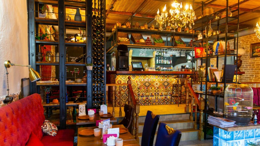
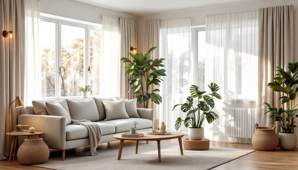
Common design styles include modern minimalist (clean lines, neutral palettes, functional without ornamentation), farmhouse (natural textures, vintage accents, warm earth tones), industrial (exposed brick or ductwork, metal fixtures, concrete), traditional (symmetry, classic furniture forms, rich colors), and transitional (a blend of traditional and contemporary elements). Some people gravitate toward mid-century modern with its tapered furniture legs and geometric patterns, while others prefer scandinavian design with its emphasis on light, simplicity, and natural wood.
The trick is not forcing a style because it looks good on Instagram. Walk through rooms where someone feels comfortable and pause: What’s actually happening? Are the lines angular or curved? Is the color palette warm or cool? Does the space feel cozy or open? Answering these honestly points toward a genuine preference rather than a trendy mimicry that’ll feel dated in two years.
Look at rooms online, design blogs, magazines, furniture retailers, and save images of spaces that spark a reaction. Not everything in those images needs to translate, but patterns emerge. After collecting 15-20 favorites, common threads usually surface. That’s the starting point for a personal design direction.
Color, Lighting, and Layout Fundamentals
Color, light, and how a room is organized work together. Mess up one and the whole space feels off.
Choosing a Color Palette
A room’s color foundation typically consists of three tiers: a dominant color (walls, large furniture, 60% of the room), a secondary color (accent walls, larger decor pieces, 30%), and accent colors (small details, art, pillows, 10%). This isn’t a rigid formula, but it prevents chaos.
Wall color matters most because it’s the biggest surface. Light colors (soft whites, pale grays, warm creams) make rooms feel larger and brighter: darker shades (deep charcoal, navy, forest green) add intimacy and drama but can shrink perception of space. Test paint samples on the actual wall before committing. Paint a 2-foot-square patch and observe it in morning light, afternoon light, and evening light. Paint color shifts dramatically depending on the light sources in the room, a gray sample may look blue under cool LED bulbs but warm under incandescent.
Secondary and accent colors should harmonize. Use a color wheel: complementary colors (opposite the wheel) create high contrast and energy: analogous colors (neighbors on the wheel) feel cohesive and calm. Many DIYers succeed by choosing a dominant neutral and layering in one or two accent colors through soft furnishings, which are easier to swap than repainting.
Lighting for Ambiance and Function
Lighting has three functional layers: ambient (general overhead light filling a room), task (focused light for reading, cooking, working), and accent (highlighting art or architectural details). A room with only ambient ceiling light feels institutional. A room with layered lighting, overhead fixture, table lamps, wall sconces, and maybe LED strip lights under shelving, feels alive and flexible.
Choose bulb color temperature measured in Kelvin (K). Warm light (2700K–3000K) feels cozy and is ideal for bedrooms and living rooms. Cool light (4000K–5000K) is better for kitchens and bathrooms where task visibility matters. Mixing temperatures in one room creates visual confusion.
Dimmers are worth the installation effort, they let the same fixture serve different moods and times of day. Position task lighting (desk lamps, pendant lights over counters) where people actually work. Avoid single sources directly overhead, which cast harsh shadows and fatigue eyes.
Natural light matters too. If a room gets strong afternoon sun, consider sheer curtains or roller shades to diffuse light without blocking it entirely. In darker rooms, mirrors positioned across from windows bounce light deeper into the space.
Furniture Selection and Spatial Planning
Furniture is how a space becomes functional. Choosing the right pieces, and arranging them thoughtfully, defines whether a room actually works.
Start by understanding the room’s traffic flow. Stand at the entry and trace the natural path people walk. Avoid blocking that path with furniture islands or low-profile pieces that create awkward navigation. Next, identify the room’s focal point: a fireplace, a large window, an art piece, or in the bedroom, the bed. Most seating or major furniture should orient toward or acknowledge this focal point.
Measure carefully. Write down the room dimensions, window and door locations, and architectural features. Sketch a floor plan on graph paper or use a free digital tool like Floorplanner. Measure furniture depth and width, a sofa listed as “88 inches” refers to its overall length, not depth, which might be 40 inches and take up significantly more floor space than expected.
Furniture scale matters enormously. A tiny loveseat looks lost in a large living room: an oversized sectional overwhelms a small bedroom. As a rough guide, the largest piece of furniture should occupy no more than one-third of the room’s visual square footage. In a 12×14-foot room, a 7-foot sofa is reasonable: a 9-foot sectional might crowd it.
Material durability depends on use. High-traffic family rooms need stain-resistant, washable fabrics (performance fabrics, leather, tightly woven cotton blends). Formal living rooms see less wear and can embrace lighter, more delicate materials. Wood furniture should be solid or quality veneer, not particleboard, if longevity matters.
Leave breathing room. Furniture pushed against every wall actually makes a room feel cramped because nothing has definition. Floating a sofa a few feet from the wall, or creating a small seating arrangement in the middle of a large room, paradoxically makes it feel bigger and more intentional.
Final Touches: Decor and Accessories
After the foundation, style, color, light, and furniture, decor brings personality and completeness.
Artwork and wall decor anchor a room visually. A single large piece or a thoughtful gallery wall (3–5 pieces arranged intentionally) works better than random small frames scattered about. Hang art at eye level, roughly 57–60 inches from the floor to the center of the frame. Ensure artwork size suits the wall: above a sofa, a piece should be roughly 50–75% of the sofa’s width.
Textiles, throw pillows, blankets, curtains, rugs, add color, softness, and warmth. Mixing textures (a smooth linen pillow with a chunky knit, for instance) creates visual interest. Rugs define spaces and add comfort underfoot: a living room rug should ideally anchor the seating group with at least the front furniture legs on the rug.
Plants and greenery improve air quality and add life without much cost. Even low-light spaces work with pothos or snake plants: brighter corners support fiddle leaf figs or monstera. Grouped in clusters (odd numbers, three or five, feel more dynamic), plants feel intentional rather than scattered.
Accessories should reflect personality, books, decorative objects, ceramics, but don’t overcrowd shelves or surfaces. Aim for roughly 50% empty space to 50% styled items: this looks curated, not cluttered. Avoid the temptation to fill every surface. Negative space is a design tool.
Layering these finishing touches over several weeks, rather than buying everything at once, lets the room evolve and prevents the “just bought it all yesterday” look. It also allows the budget to spread naturally.
Conclusion
Home interior design works best when it balances personal preference with practical function. Start by defining a design direction that genuinely resonates, then methodically build through color, lighting, and well-scaled furniture before layering in finishing decor. The goal isn’t a magazine-perfect room, it’s a space that feels good to live in, supports how a household actually functions, and reflects the people calling it home. Small, intentional choices compound into a cohesive, beautiful interior.