Grey has cemented itself as one of the most versatile and enduring colors in interior design. Far from being dull or lifeless, grey serves as a sophisticated foundation that balances warm and cool tones, allows accent colors to shine, and adapts seamlessly across different design styles, from minimalist to industrial to traditional. In 2026, grey continues to dominate designer inspiration boards and homeowner projects alike, not because it’s trendy, but because it actually works. Whether someone is repainting a living room, refinishing cabinets, or selecting new furnishings, understanding how to use grey effectively transforms a space from feeling flat to feeling intentional and polished.
Key Takeaways
- Grey interior design works as a versatile foundation because it balances warm and cool tones, hides imperfections, and adapts seamlessly across minimalist, industrial, and traditional styles.
- Understanding grey undertones—warm greys with brown or tan hints versus cool greys with blue or green hints—is essential; always test paint samples on actual walls under natural and artificial light before committing.
- Grey performs differently across rooms: use mid-to-light shades in living rooms and bedrooms for airiness, soft grey for kitchen cabinetry, and slightly darker greys in hallways to add definition without overwhelming.
- Layer grey with varied textures, accent colors, and organic materials like plants; avoid flat, one-tone grey rooms by introducing contrast through trim colors, textural variation, and complementary hues like terracotta or navy.
- Common grey interior design mistakes include using too much sameness in tone, ignoring room lighting conditions, forgetting texture, mixing clashing undertones, and neglecting accent colors that bring the space to life.
Why Grey Is the Ultimate Interior Design Staple
Grey doesn’t demand attention the way bold colors do. Instead, it creates breathing room, giving the eye a place to rest while letting other design elements take center stage. This neutrality is precisely what makes grey so powerful, it’s a canvas rather than a statement.
From a practical standpoint, grey hides dust and minor imperfections better than whites or light neutrals, which matters in high-traffic areas like hallways and family rooms. It pairs effortlessly with both warm and cool color families, meaning someone isn’t locked into a specific palette when they choose grey walls. A grey living room works equally well with warm terracotta accents or cool jewel tones.
Grey also bridges different design eras. A dove grey bedroom feels equally at home in a mid-century modern space, a contemporary apartment, or a farmhouse-style cottage. This timeless quality means an investment in grey paint, flooring, or cabinetry won’t look dated in three years. For homeowners hesitant about committing to bolder colors, grey offers confidence without compromise.
Shades of Grey: Understanding the Color Spectrum
Not all greys are created equal. The difference between a flat, lifeless grey and one that feels rich and inviting often comes down to undertones, those subtle warm or cool hues hiding beneath the surface.
When shopping for grey paint, compare samples on actual walls in natural and artificial light. Many people bring home a sample swatch only to paint an entire room and discover it looks completely different once applied. Lighting changes everything: morning north light shifts a grey’s appearance differently than evening west-facing light.
Warm Greys vs. Cool Greys
Warm greys contain hints of brown, tan, or yellow undertones. Greige (a blend of grey and beige) falls into this category and feels softer and more inviting than pure grey. Warm greys work well in spaces where homeowners want coziness without sacrificing sophistication, kitchens, bedrooms, and dining areas benefit from these friendlier tones.
Cool greys lean toward blue, green, or purple undertones. These create a more modern, crisp feeling and pair beautifully with stainless steel appliances, concrete elements, or contemporary furniture. Cool greys excel in bathrooms and office spaces where a clean, focused atmosphere helps.
The key is testing multiple paint brands in the same undertone category. Benjamin Moore’s “Stonington Grey” and Sherwin-Williams’ “Agreeable Grey” are both warm greys but read quite differently depending on lighting and adjacent colors. Buy sample quarts, paint large swatches (at least 2 feet by 2 feet), and observe them over 24 hours before committing.
Grey in Different Rooms: Room-By-Room Applications
Each room in a home has different lighting conditions, function, and mood requirements. Grey adapts, but understanding how it performs in different spaces prevents costly mistakes.
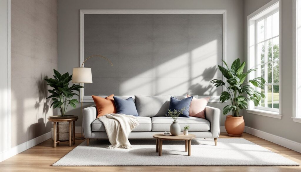
Living Rooms and Bedrooms: Mid-to-light greys create an open, airy feeling in these spaces where relaxation matters. Pair grey walls with varied textures, a linen sofa, wool throw, wooden accent table, to prevent the space from feeling cold or sparse. Grey in a bedroom promotes calm: cooler greys feel more meditative, while warmer greys feel nurturing.
Kitchens: Grey cabinetry has largely replaced white as the go-to neutral. Soft greys (#d3d3d3 in digital terms, or roughly 50–60% grey in paint nomenclature) work for base cabinets while slightly darker or brighter whites handle upper cabinets for contrast. Grey countertops or a grey tile backsplash ground the space without competing with cooking activity. Pair with stainless steel or matte black hardware for contemporary appeal, or oil-rubbed bronze for warmer, transitional style.
Bathrooms: Grey tile, grey vanities, and grey wall paint create a spa-like atmosphere. Light greys open small bathrooms: darker, cool greys add drama in larger baths. Ensure adequate ventilation regardless of grey shade, humidity affects grey tones differently than other colors, sometimes causing them to appear darker or greenish over time.
Hallways and Entries: These transitions benefit from slightly darker greys that add definition without overwhelming. A charcoal or slate grey creates structure and makes artwork or mirrors pop. Proper lighting prevents dark hallway greys from feeling tunneling or institutional.
Pairing Grey With Accent Colors and Textures
Grey’s superpower is amplifying other colors. Where a bold color against bold color can clash, grey provides a respectful stage for accent hues.
Warm Accents: Terracotta, rust, warm gold, and soft peach bring energy to grey spaces without overwhelming. A grey living room with terracotta throw pillows and a warm brass floor lamp feels inviting and earthy. Warm wood tones (oak, walnut, cherry) also complement warm grey beautifully.
Cool Accents: Navy, emerald, teal, and charcoal pair striking with cool grey. A cool grey bedroom with navy bedding and teal artwork feels fresh and intentional. Stainless steel, chrome, and cool brass (silver-toned) hardware reinforce this crisp aesthetic.
Texture is critical. Grey alone can feel flat. Layer it with materials: matte-finish paint walls, a glossy ceramic tile accent wall, a chunky knit throw, smooth concrete floors, plush area rugs, and natural wood elements. Varying sheen levels (matte, satin, semi-gloss) also adds dimension, a semi-gloss trim against matte walls creates subtle visual interest.
Plants and organic materials counterbalance grey’s cool potential. Greenery introduces life and warmth that pure architectural elements cannot. A grey room with potted ferns, fiddle leaf figs, or trailing pothos instantly feels more inhabited and less sterile.
Common Grey Interior Design Mistakes to Avoid
Grey’s versatility is also a liability, get it wrong and the result feels institutional, cold, or boring.
Too Much Sameness: Painting walls, cabinets, flooring, and trim all in similar grey tones flattens a room. Introduce contrast: grey walls with white or black trim, or grey cabinetry with contrasting countertops. Without tonal variation, even beautiful grey becomes visually exhausting.
Ignoring Lighting: Grey in a poorly lit north-facing room appears dingy and grey in harsh overhead fluorescent light feels institutional. Before committing, test grey samples under the exact lighting conditions of the space. If natural light is minimal, consider warm grey rather than cool grey, and add task lighting to brighten work areas.
Forgetting Texture: A room painted entirely in flat grey matte without textural variation (rugs, upholstery, wood, metal) risks feeling sterile. Introduce variation intentionally, patterned wallpaper, woven baskets, ceramic vessels, or a brick accent wall add visual interest that pure color cannot.
Clashing Undertones: Mixing a warm greige with a cool grey-blue creates visual tension unless intentional. Ensure grey paint, flooring, and cabinetry share compatible undertones. A warm grey kitchen with cool grey tile backsplash feels disjointed: both should skew warm or both cool.
Neglecting Accent Color: All grey, no accents is design purgatory. Grey needs companions, whether that’s navy artwork, warm brass lighting, or pops of color through textiles. Without these layers, the space feels incomplete.
Conclusion
Grey interior design succeeds when it’s treated as a foundation, not a limitation. The color’s true strength lies in its ability to unify spaces, provide visual calm, and allow intentional accent colors and textures to elevate a design scheme. Success requires understanding undertones, testing samples in real lighting, varying tonal values and sheens, and committing to thoughtful texture and color layering. In 2026, grey remains the default choice for designers and homeowners who value sophistication, versatility, and longevity, proof that sometimes the most powerful design choice is the one that never shouts.