Dreaming of owning a cozy little café that’s a haven for coffee lovers, but held back by a tight budget? Don’t fret. With a dash of creativity and resourcefulness, you can transform a small space into a charming café that customers can’t resist.
Low Budget Small Cafe Interior Design
When exploring low budget cafe interior design, three primary aspects come into play: space utilization, color palette, and furniture selection.
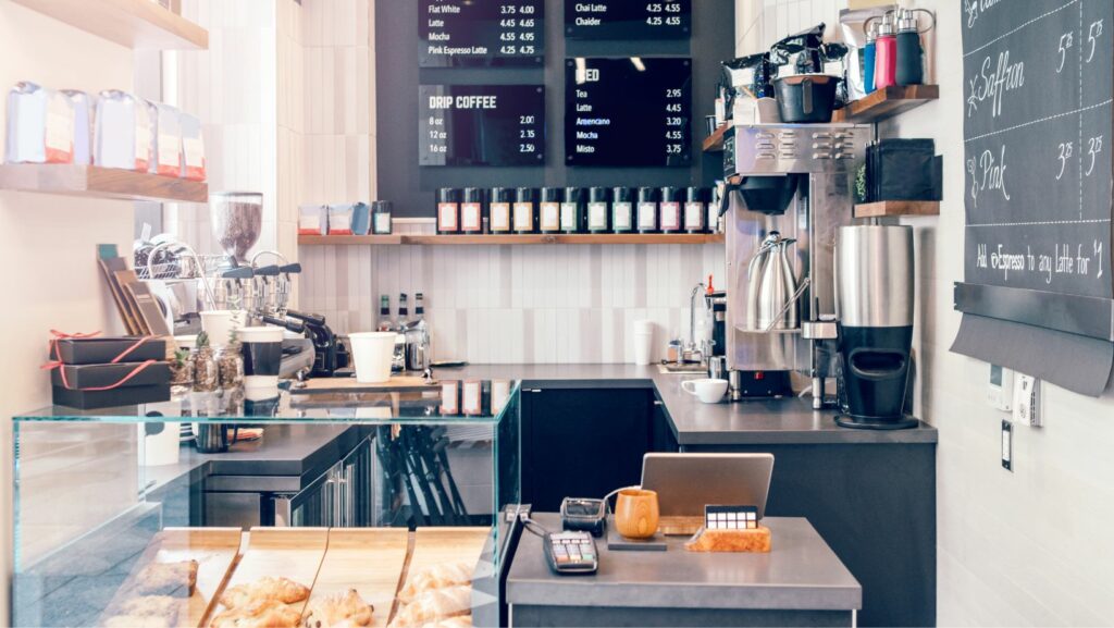
First, an efficient use of space maximizes customer capacity, ensuring an increase in potential revenue. For example, employing wall-mounted shelves and countertops provides extra room without sacrificing functionality.
Second, adopting a coherent color palette vitalizes the cafe ambiance. Consider the psychology of colors: blues and greens create a calm atmosphere, while vibrant hues like red and yellow stimulate energy. Remember, it’s not necessary to paint the entire premises. Pop of colorful cushions or wall arts are cost-effective ways to introduce color.
Finally, tactical furniture selection serves dual purposes. Vintage items found at a thrift shop, for example, provide a unique aesthetic and an economical solution. Multipurpose furniture, such as stools doubling as storage units, optimizes the space and saves money.
Key Elements of Small Cafe Interiors
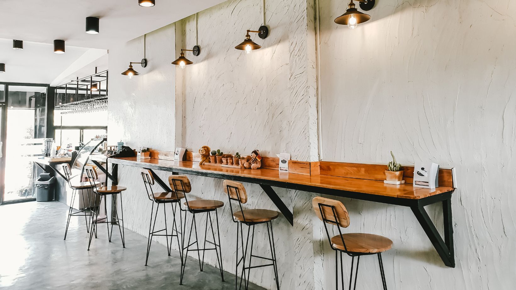
Efficient use of space stands as an integral part in designing a small café. When space is scarce, each square foot counts, emphasizing the need for clever layout design. Incorporate multipurpose furniture, like tables with hidden storage options, for added utility. Strategic placement of mirrors can create an illusion of increased space, enhancing the feel of openness.
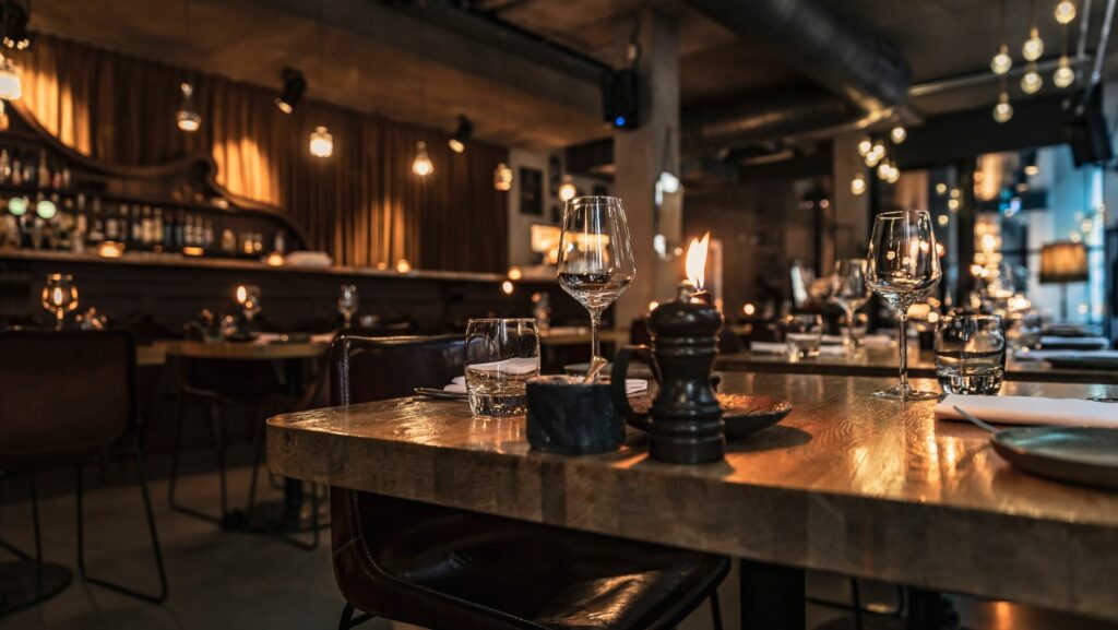
Lighting, another fundamental element, influences the café’s mood and energy. Bright, soft lighting contributes to a lively atmosphere, while dimmer lights offer a calm, relaxing ambiance. Use a mix of both, adjusting as per the day’s time and café’s vibe.
A consistent color scheme, as discussed earlier, reinforces the café’s identity and character. It draws patrons in, evoking a desired emotional response. Stick to the chosen palette throughout the café, be it for furniture, walls, or accessories.
Creative Use of Space
In a small cafe, each inch counts. Maximizing utility is crucial, not an option. Store owners are advised to think vertically and use furniture that serves multiple purposes. For instance, stools double as storage containers and wall-mounted shelves serve as decorative displays while offering extra storage. High ceilings offer another opportunity for adding floating shelves or hanging basket storage for items rarely needed or for additional decor.
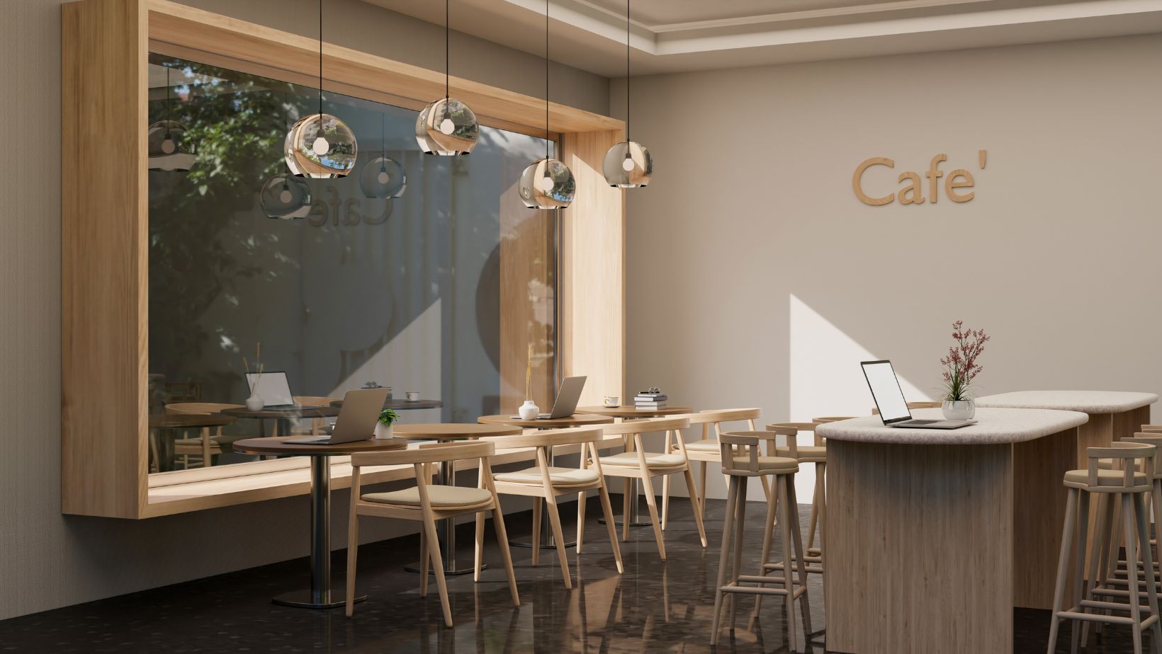
Making room for customers translates to efficient use of space. The arrangement of tables, chairs, and counter space impacts the entire café’s perceived size. A balanced configuration, free of cramped corners and awkward pathways, further maximizes space and facilitates easier navigation for both staff and guests. It reflects thoughtful space utilization, critically affecting the café’s ambiance, function, and overall customer satisfaction.
Lighting, another vital component, establishes mood and enhances the perception of the café’s size. Shadows and dark corners can make a space feel cramped, so a combination of bright, general overhead lighting and focal, task-oriented lights can dramatically transform the through space. It’s through such careful, creative use of space that a small café can truly define its character and charm, operating efficiently while maintaining attractive aesthetic appeal.
Choosing the Right Color Palette
Settling on the appropriate color scheme plays a critical part in enhancing a café’s atmosphere. Colors affect how customers perceive space, thus, picking a palette that complements the café’s size matters. Lighter hues, for instance, whites and pastels, can make a small space feel larger and brighter. In contrast, darker shades create an intimate and cozy atmosphere, albeit shrinking the perceived space.
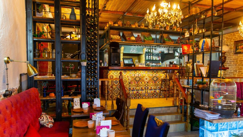
Textures and patterns too, contribute to the visual dimension and should harmonize with your chosen color palette. Incorporating contrasting textures, like a rustic brick wall paired with smooth wooden finishes, adds depth and character.
Finally, consider the café’s brand identity. The chosen color scheme and textures ought to reflect the café’s persona. A vibrant and youthful café may benefit from bright, bold colors, while a tranquil café might embrace earthy tones and natural textures.

