Most homeowners assume balance means matching furniture on either side of a room, but that’s only one approach. Asymmetrical balance in interior design creates visual harmony by distributing visual weight unevenly across a space, resulting in layouts that feel dynamic, modern, and intentional rather than static or formal. This technique has become essential for DIY home improvers and designers looking to break free from predictable, mirror-image layouts while maintaining a cohesive, restful environment. Whether rearranging a living room, redesigning a bedroom, or reimagining an open-plan space, understanding asymmetrical balance transforms how rooms function and feel.
Key Takeaways
- Asymmetrical balance in interior design creates visual harmony through uneven distribution of visual weight, producing dynamic and modern spaces without rigid mirror-image matching.
- Establish a focal point as your room’s anchor, then distribute visual weight across multiple zones using layered smaller elements that feel visually equivalent without exact matching.
- Visual weight depends on color darkness, object size, texture, and distance from the viewer—use these factors strategically to balance a heavy piece on one side with lighter, textured elements on the other.
- Maintain cohesion in asymmetrical rooms by repeating unifying elements like color, materials, and design motifs throughout the space while preserving breathing room to prevent clutter.
- Apply asymmetrical balance practically by positioning furniture off-center in living rooms, using misaligned wall décor in kitchens, and creating varied-height shelving that feels intentional rather than random.
- Avoid confusing asymmetrical balance with disorder; every element must justify its presence through function or design, and arrangements should support how your household actually uses the room daily.
What Is Asymmetrical Balance In Interior Design
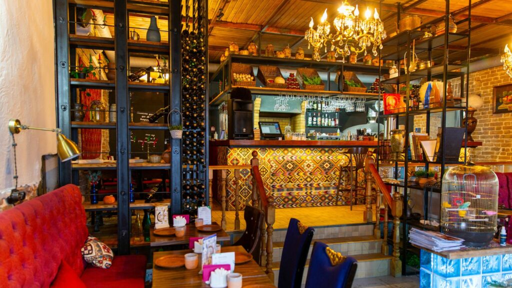
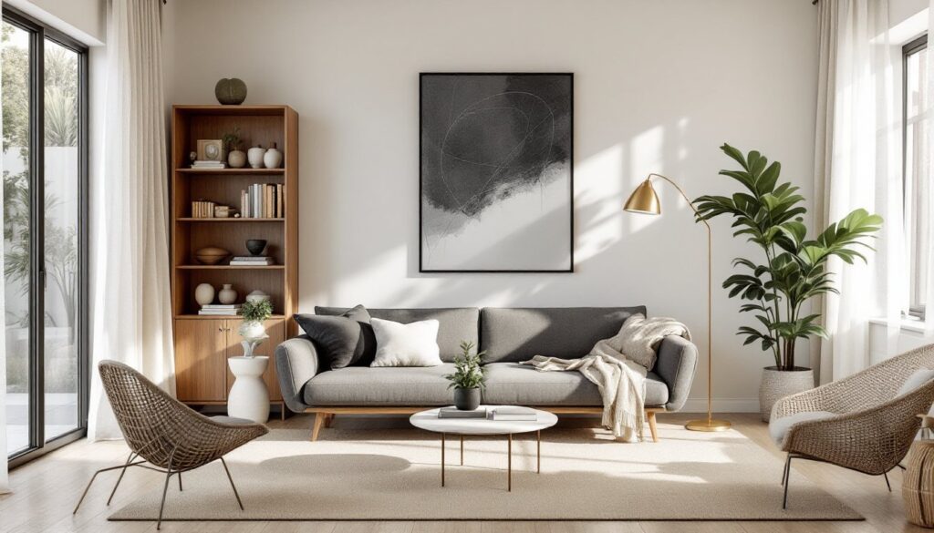
Asymmetrical balance, also called informal balance, arranges furnishings, colors, textures, and décor across a space without mirror-image repetition. Rather than placing a sofa with matching nightstands on either side, asymmetrical design might position a large bookshelf on one wall, balanced by a cluster of artwork and a smaller accent table on the opposite side.
This approach relies on visual weight distribution, the perceived heaviness or impact of design elements. A dark, oversized piece creates more visual weight than a light, small one, even if they’re placed at different distances from the room’s center. Think of it like a teeter-totter: a heavier object closer to the pivot point can balance a lighter object farther away.
Asymmetrical balance works because the human eye naturally seeks equilibrium. When visual weight is distributed thoughtfully, the brain perceives the space as intentional and comfortable, even though nothing matches exactly. This is fundamentally different from symmetrical balance, where identical or near-identical elements flank a central axis.
Why Asymmetrical Balance Matters For Modern Spaces
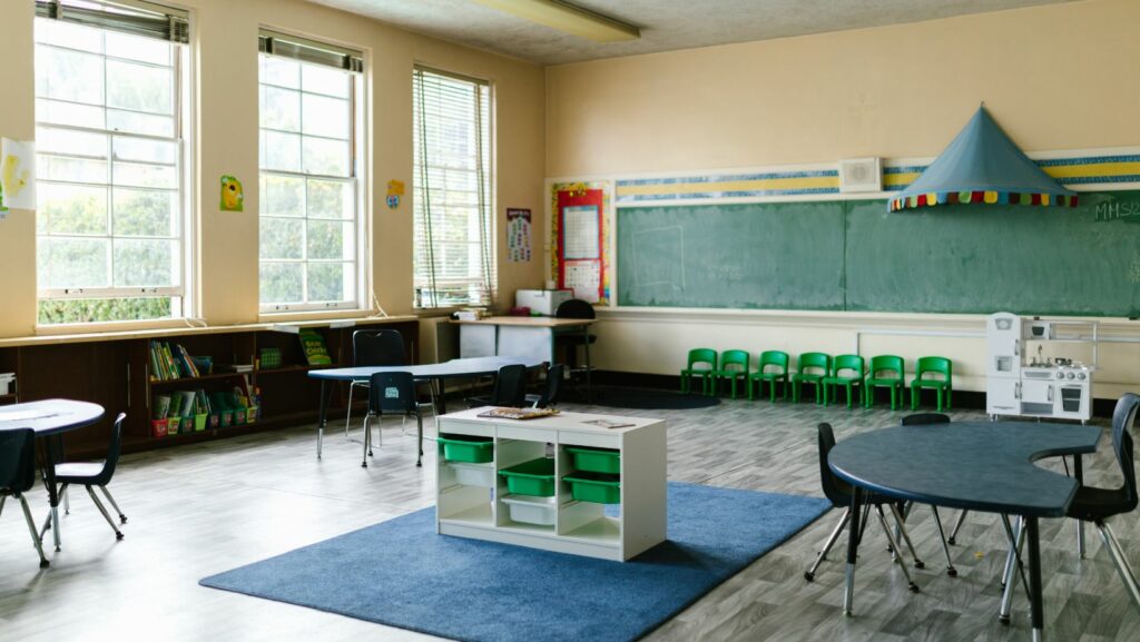
Modern homes rarely function as formal museums. Families live in open-plan layouts, multitasking spaces, and rooms with irregular footprints, hardwood floors meeting tile, angled ceilings, asymmetrical windows. Symmetrical balance often feels stiff and impractical in these real-world conditions.
Asymmetrical balance embraces the imperfections and irregularities that define contemporary living. It allows rooms to feel curated and sophisticated without feeling staged. A corner reading nook with a tall floor lamp and single armchair can balance an entertainment wall across the room, creating visual interest and functional zones.
This approach also encourages sustainable, creative redecorating. Instead of buying matching sets, DIYers can mix vintage finds, repurposed furniture, and new pieces, knowing that balance comes from thoughtful arrangement, not uniformity. Rooms designed this way typically feel more personable and less cookie-cutter, which is why asymmetrical balance dominates contemporary interior design magazines and Instagram feeds.
Key Principles For Creating Asymmetrical Harmony
Creating asymmetrical balance requires understanding a few core principles. First, establish a focal point, often a fireplace, window wall, or accent wall. Everything else in the room should relate to and support this anchor without mirroring it.
Second, distribute visual weight across multiple zones. If one side of the room has a large media console, balance it with layered smaller elements on the opposite side: a bookshelf, wall art, a side table with a lamp, and plants. The total visual impact feels equivalent even though the pieces differ.
Third, use repetition and rhythm. Asymmetrical rooms still need unifying elements, repeated colors, materials, or design motifs, to feel cohesive rather than chaotic. Scatter the same throw pillow color across different seating zones, or repeat wood tones in flooring, furniture, and trim.
Fourth, respect negative space. Asymmetrical rooms benefit from breathing room. Empty wall space or uncluttered floor area acts as a visual reset, preventing the space from feeling cramped even though having substantial furnishings.
Using Visual Weight To Build Balance
Visual weight determines how heavy or impactful an element feels to the eye. Dark colors carry more weight than light colors. Large objects outweigh small ones. Detailed, patterned, or textured surfaces command more attention than smooth, plain ones. Warm colors (reds, oranges, yellows) advance visually, creating more weight, while cool colors (blues, greens) recede.
Practically, this means a dark burgundy accent wall on the left side of a room might be balanced by a lighter wall color plus a large, textured mirror or gallery wall on the right. A heavy wooden credenza (a low, horizontal storage piece, about 36 to 48 inches wide) positioned against one wall can be counterbalanced by a tall floor-to-ceiling bookshelf or vertical wall paneling elsewhere.
Distance from the eye also affects perception. An object farther from where you sit feels less visually present, so you may need to increase its size or intensity to balance a closer, smaller element. Test arrangements by stepping back and viewing the room from the main seating area: this is where most occupants will experience the space.
Practical Applications In Living Spaces
In a living room, avoid flanking the sofa with identical side tables and lamps. Instead, position the sofa off-center and anchor one side with a tall floor lamp and round side table (typically 24 to 28 inches in diameter), then balance the opposite side with a stacked bookshelf or console table and wall art above it. The key is that both zones feel visually substantial and intentional.
For bedrooms, skip the matched nightstands. Place a bed against one wall without a nightstand, then add a small floating shelf (12 to 18 inches deep) or a single table on the opposite side. Hang a statement light fixture or wall sconce asymmetrically, and layer different textured throw blankets and pillows in coordinating colors.
In open-plan spaces, use area rugs and furniture groupings to create asymmetrical zones. A living area rug anchoring a sofa and coffee table on one side of the room can be balanced by a dining table and chairs in an off-center position on the other side. Vertical elements, a tall plant, bookshelf, or room divider screen, help define zones without rigid symmetry.
Kitchens and dining areas benefit from asymmetrical styling too. Open shelving on one wall paired with solid cabinetry on another, pendant lights hung at varying heights, and a misaligned gallery wall create visual rhythm without feeling chaotic. The same principle applies to wall-mounted shelving and display: vary shelf depths, heights, and spacing rather than installing uniform units.
Common Mistakes To Avoid When Designing Asymmetrically
The biggest mistake is confusing asymmetrical balance with clutter or randomness. Just because nothing matches doesn’t mean anything goes. Every element should justify its presence through color, texture, scale, or function. If a room feels busy or disorienting, you’ve likely sacrificed balance for novelty.
Another frequent error is ignoring sightlines. Arrange furniture to support how people actually move through and sit in the room. An awkwardly placed accent chair or floating shelf that interrupts a natural pathway disrupts the mental sense of balance, even if the visual weight theoretically balances.
Don’t forget about vertical balance either. Rooms with tall elements (shelving, curtains, art installations) on one side need visual height on the opposite side, perhaps a sloped ceiling, tall mirror, or hanging plants, to feel stable. Heavily weighted lower sections with empty upper walls create visual instability.
Poor color distribution is another pitfall. If all warm colors cluster on one side and cool colors on the other, the room will feel split rather than harmonious. Distribute color throughout the space in roughly equal intensities, even if specific objects aren’t matched.
Finally, ignoring the room’s function weakens balance. An asymmetrical arrangement that looks stunning in photos but makes the space unusable for everyday living is eventually unsuccessful. Your design should support how your household actually uses the room, not just how it photographs.
Conclusion
Asymmetrical balance offers DIY decorators and designers a flexible, modern approach to creating harmonious interiors without rigid matching. By understanding visual weight, distributing colors and textures thoughtfully, and maintaining intentional negative space, any room can feel collected, sophisticated, and livable. The result is a home that reflects real life, beautifully balanced, but authentically yours.